Enslain Metal Merch
About Enslain.net
Chrissy Hujanen - a.k.a. "Lady Enslain" is a fellow American living in Finland and a close friend of mine. She's been a mover and shaker within the Finnish Metal scene since moving to Finland in 2008. Recently, she's been focusing primarily on providing merchandise services for bands and festivals in Finland and abroad.
The content and target audiences
Chrissy and I have been talking about her merch adventures for years. So, I knew exactly the content needed for her site. Specifically, the content for the services page that targets bands and promoters to expand her customer base. She also wanted a page dedicated to recruiting volunteers to sell merch under her banner in cities throughout Finland, along with lists containing upcoming and past events she and her team have been hired to handle. As for the site's tone, Chrissy wanted a friendly, informal vibe with jokes and easter eggs peppered throughout.
The design and aesthetics
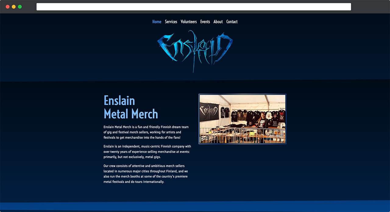
When I asked Chrissy if she wanted something minimalistic, she replied: "Not really, I'm definitely a 'more is more' type of person." "Bold, fun, and colorful" is what came to my mind. Sweet! This meant I could have some proper fun with CSS and create something more flashy than the minimalistic fare I usually build. Here's what I came up with:
- Blue, blue, and even more blue. Always blue. Why did I choose blue as the star color for this design? Chrissy absolutely loves blue. It pays to know your client. And mine is happy with the color scheme I chose for her. Slam dunk.
- Various color gradients, some of which were combined with animations for links and buttons on hover and active states (only for users who don't have their device's motion preference set to "reduce", of course).
- Bold alternating diagonal polygon shapes for each section's background using the CSS clip-path property.
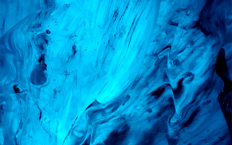
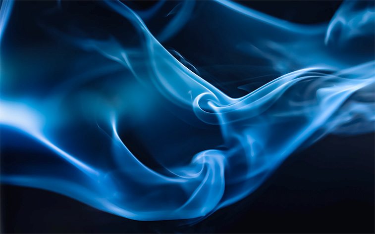
- And, of course, my favorite bit of flair on the site - the Enslain logo in the header. I used the CSS mask-image property to mask the logo SVG over these beautiful blue abstract photos I found on Unsplash that perfectly complement the dark and light themes of the site. I learned how to do this with the help of Kevin Powell's excellent mask-image video. This is the first time I've been able to ship something so bold and flashy for a client!


Conclusion
Overall, this was a fun project. One that allowed me to explore my creativity with CSS while building something related to a few subjects I'm very familiar with - my lovely friend, her merch business, and metal!
